How Customization Affects Corporate T-shirt Appearance
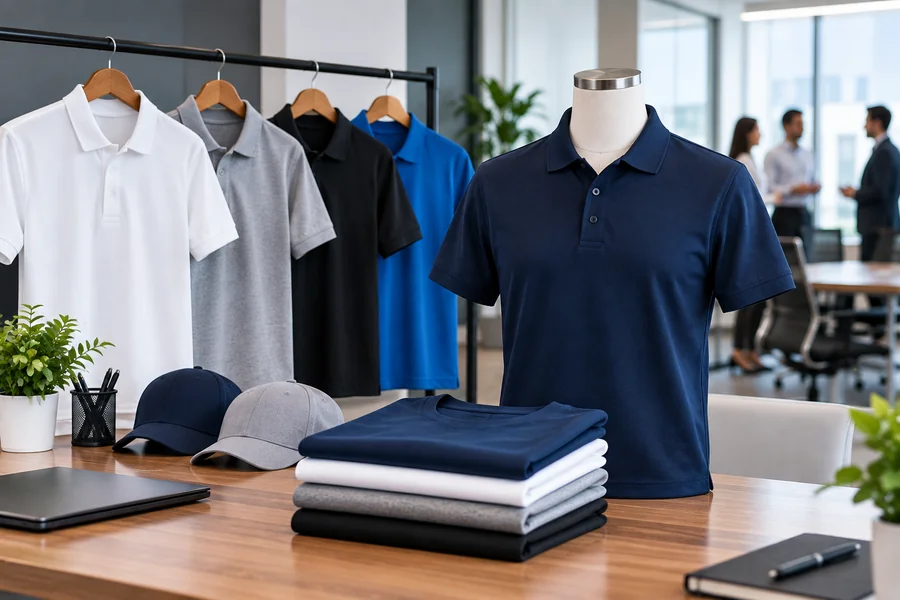
Corporate t-shirts can be used as mobile advertisements and team identifiers in big businesses and small ones. This guide describes the impact of customization on the appearance of corporate t shirts and these include design options that have an impact on a professional perception. These are oriented toward assisting businesses to make right choices on branded clothing, which reflects the business well.
How customization choices influence the look and impact of corporate t-shirts
Printing methods and their visual impact
The printing process will define how a design or logo will look on the fabric. Screen printing represents bold and tough colours of plain designs and high quantity. Embroidery provides an upscale, textured appearance, which compliments polos and fabric heavier items. Multi-coloured, photographic detailed designs are done by direct-to-garment printing. Important printing factors will be:
- Screen printing: It is suitable on large orders colourful designs simple and bold.
- Embroidery: Adds a high-quality feel which is best used on polos and jackets with logos.
- Direct-to-garment: Suits in-depth, multi-coloured artwork with no set up costs.
- Heat transfer: Best on small run and complex designs.
- Vinyl cutting: Provides clear edges with ease of text and single colour logos.
Colour selection and brand consistency
Direct influences on the perception of the corporate t-shirt are colour choices. The appropriate use of the shirt colour matching the brand guidelines would be an instant recognition and professionalism. A combination of high contrasts between shirt and print enhances visibility. The neutral choices of shirt colours also make the logos stand out and compete less in terms of attention. Colour considerations include:
- Brand colour matching: The same Pantone references will give the logo the same appearance on shirt and signage and on digital platforms.
- Contrast for visibility: Dark logos in light shirts or light logos in dark shirts are the most readable and therefore branding can be read at a distance in any setting.
- Neutral base colours: White, grey, black shirts apply to most logo designs and they may be used as a versatile foundation which can be applied in many situations in different departments.
- Seasonal palettes: Adjusting colours to events or campaigns makes apparel new without the need to redesign basic aspects of the logo.
- Colourfastness: The selection of good ink and fabrics helps avoid fading of t-shirts straight away after a wash; the corporate t-shirts will still stay professional-looking after numerous applications.
Design placement and sizing
The position of a logo on a t- shirt influences its appearance and visibility. The left chest position has a classic, professional appearance to be worn daily. Full-front prints will make an impactful statement during events and campaigns. The detail of sleeve and back placements serve to enhance the front aspect without dominating it. Placement, Sizing considerations are:
- Left chest logo: A classic selection of corporate uniforms and everyday wear opportunity that would provide professional and understated positioning of the brand.
- Full front print: Eye-catching and bold when it comes to promotional events, thus giving maximum exposure and creating a great impression.
- Back prints: Large designs that make the wearer a walking billboard, which are best to use with team names and sponsor recognition.
- Sleeve details: Small branding to match the dominating design to give it an elegant feel without adding too much to the overall appearance.
- Proportional sizing: Logos are neither too small nor too large as they are upheld and balanced in all sizes of garments.
Fabric choice and its effect on appearance
The type of fabric will determine the effect of a customized t-shirt on the way it flows, the sensation it gives as well as the wearability. Cotton has a traditional appearance and it is breathable but will shrink. Polyester fibre blends do not wrinkle and pack colour. Tri-blends have a light, vintage look that is good in retail type styles. Fabric considerations include:
- 100% cotton: Airy and easy to wear but in danger of shrinking, it is ideal when used in casual offices as well as daily use.
- Cotton-poly blends: A high value durable, wrinkle-resistant, colourfast blends, ideal in the frequently-worn uniform and high-frequency areas.
- Tri-blends: Light and not so dense, very contemporary in branding, and with a high-quality retail experience, it uplifts corporate-wear.
- Performance fabrics: Active or outdoor performance fabrics, which are moisture-wicking and keep the wearers dry and comfortable when performing physical activities.
- Ring-spun cotton: Smooth and soft like regular cotton, but with a higher quality, resulting in printing finer and a much higher fashionable look.
A look at the frequently asked questions
What is the best method of printing on corporate t-shirts?
Large order screen printing, embroidery on high end polos and DTG on highly detailed designs.
What is the best way of matching brand colours?
Give references to Pantone and seek samples prior to complete production.
In what locations do we place a logo on a corporate t-shirt?
Everyday wear on the left chest, full on front for events, and large branding on back.
Does choice of fabric influence quality of prints?
Yes, tight/smooth fabrics give sharper prints compared to loose knits.