Restroom Signs That Keep Navigation Effortless
The best spaces are the ones that guide you naturally. Without asking for directions or stopping to think, you find what you need — a meeting room, an exit, or a restroom. That quiet efficiency doesn’t happen by accident. It’s the result of functional design and clear communication through small but essential details like signage.
In buildings where people come and go constantly — offices, hotels, cafés, or schools — restroom signs play a crucial role in keeping movement smooth and stress-free. They provide direction, privacy, and accessibility, all while fitting seamlessly into the interior design.
Restroom signs — Bsign demonstrate how functional thinking can make orientation almost invisible yet perfectly effective.
The role of restroom signage
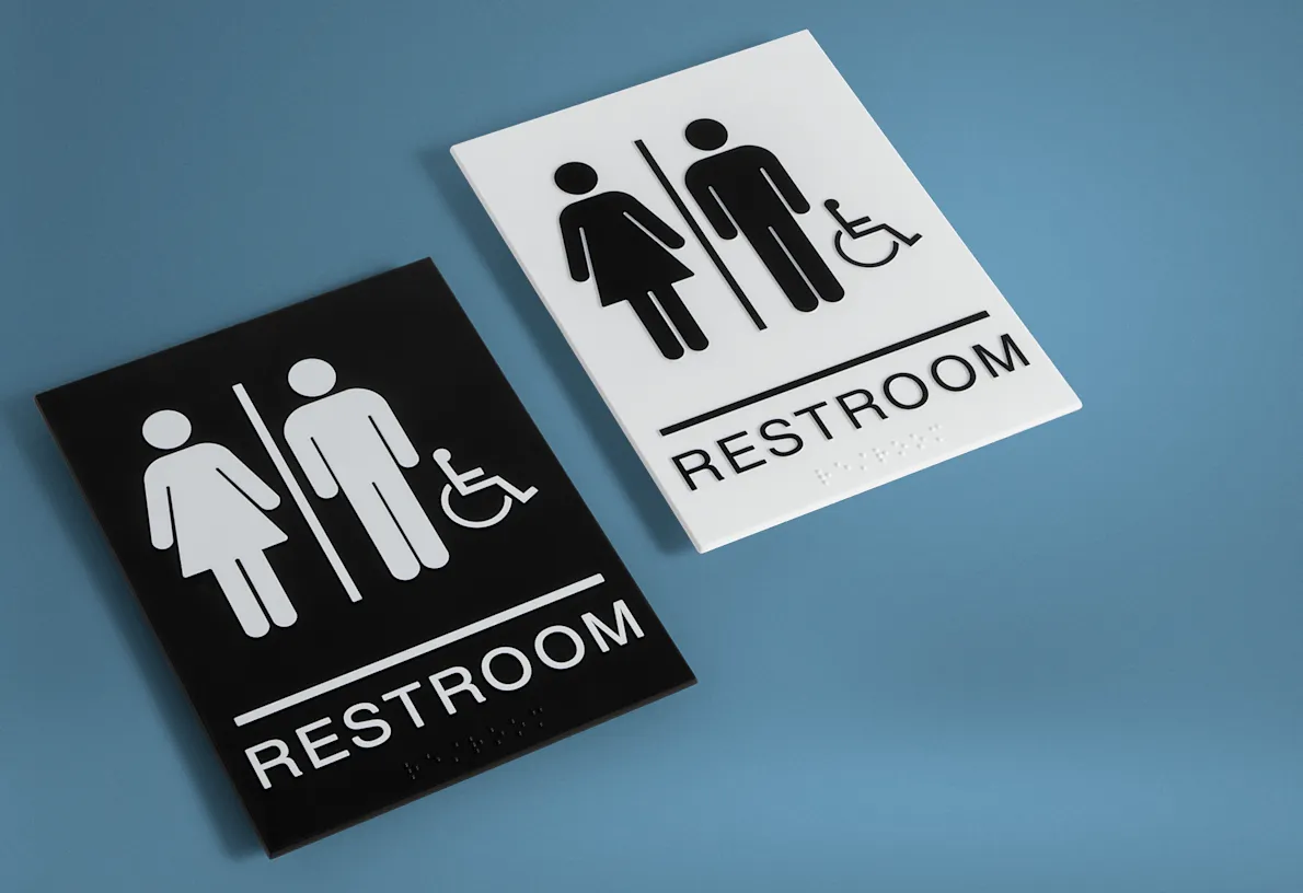
Restroom signage is not decoration — it’s infrastructure. Every visitor expects to find restrooms easily, without searching or asking. A clear, readable sign ensures that experience. It saves time, reduces confusion, and keeps the flow of movement steady.
![]()
Good restroom signs combine two qualities: clarity and placement. They must be visible at a glance, placed logically along the visitor’s route, and instantly recognizable through consistent symbols.
When these signs do their job well, people barely notice them — and that’s exactly the point.
Functional design principles
Designing functional signage starts with simplicity. Information has to be communicated faster than words can be read. That’s why designers focus on universal symbols, clean contrasts, and predictable positioning:
- Contrast: light backgrounds with dark symbols (or the reverse) increase visibility from a distance.
- Simplicity: clear male, female, and accessible icons work better than stylized or overly creative designs.
- Consistency: all restroom signs within one building should follow the same format — same scale, icon style, and material.
These principles keep orientation intuitive and prevent unnecessary pauses or mistakes.
Materials that support function
The materials used for restroom signage affect not just appearance, but also durability and legibility. Functional spaces demand surfaces that withstand frequent cleaning, humidity, and constant contact.
That’s why designers rely on wood, acrylic glass, or stainless steel — three materials that combine resilience with clarity:
- wood adds warmth and softness, ideal for hotels or restaurants;
- acrylic offers crisp readability and a smooth finish, perfect for offices and schools;
- stainless steel ensures hygiene and endurance, making it suitable for hospitals and public buildings.
Each option supports long-term functionality while maintaining an understated, professional look.
Placement and accessibility
A functional restroom sign is not only about design; it’s about logic. The best signs are placed where people naturally look — near entrances, intersections, or along main corridors. They should always be visible before a decision point, not after it.
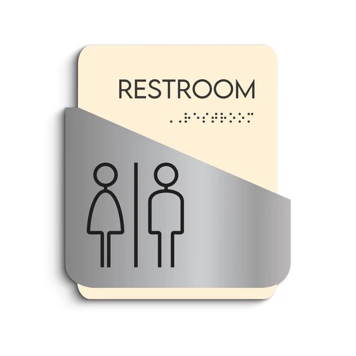
Accessibility matters too. Signs mounted at consistent eye level (typically 55–60 inches from the floor) are easier to locate for everyone. In public facilities, adding tactile or Braille elements ensures that the information remains available to all visitors, regardless of ability.
Clear placement and inclusive design transform simple wayfinding into an act of respect.
Read Also: The Art And Design Evolution Of Wedding Photography In Southwest Florida
When function shapes experience
Restroom signage rarely gets attention — and that’s what makes it so important. When it works perfectly, people don’t even notice it. They just move confidently, without hesitation or discomfort.
That’s the quiet success of functional design: making navigation natural, predictable, and stress-free.
A well-designed restroom sign doesn’t need to stand out. It just needs to work — reliably, day after day — guiding people with clarity and care.