Sustainable Boutique Branding: Storefront That Converts
A storefront is more than a sign and a window. It is a short conversation with anyone who walks by: who you are, what you value, and whether it’s worth stepping inside. When that conversation is clear, consistent, and sustainable, conversion improves without gimmicks. This guide focuses on materials, lighting, messaging, and day-to-day upkeep so an independent boutique can build a storefront that lasts and sells.
Why sustainable boutique branding is a performance asset
Sustainability should not sit apart from sales goals. Durable finishes reduce replacement cycles. Clear typography and balanced contrast improve visibility. Materials that age well make a shop look cared for. If the brand’s values include lower-impact choices, that should show at the curb, not just on product pages. For a neutral frame on lifecycle and waste, EPA’s sustainable materials guidance outlines how material choices affect maintenance and disposal without prescribing a single aesthetic. The commercial payoff is straightforward: when the exterior looks intentional week after week, more people cross the threshold, and those who do arrive in a buying mindset.
Materials and finishes that carry your brand
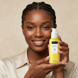
Pick a primary finish and repeat it across plaques, address numbers, hours panels, and small wayfinding tags. Consistency reads as calm and professional. A practical option for exterior nameplates is corrosion-resistant brushed metal; the soft sheen avoids glare in direct sun, pairs well with wood or recycled glass, and holds up in coastal air. Carry the same finish onto interior mounting hardware and shelf-edge markers so the eye doesn’t fight competing textures. If your brand story leans on fabrics and care, bring that language forward. A concise panel about garment care or resale near the handle gives substance without crowding the window. For tone and scope, Amour Vert’s overview of sustainable fashion is a clean example of how to talk materials without lecturing.
Signage that converts without shouting
Type matters more than people think. Legible, high-contrast letterforms at the right size beat decorative script every time, especially from across a two-lane street. Keep the number of messages low: store name, a short value promise, and hours. Make sure the copy on the glass matches what’s on exterior plaques. If you add small directional tags for pickup, tailoring, or repair intake, keep the finish, line weight, and type system identical to the main sign so the experience feels guided, not improvised. If you’re building a visual system from scratch, this Amour Vert primer on boutique branding shows how to set hierarchy and carry it across touchpoints, from door hardware to hangtags.
Light for visibility, mood, and cost
Good lighting earns its keep by doing three things at once: it renders color accurately, it avoids harsh glare, and it keeps the bill predictable. Warm-to-neutral LEDs with higher color rendering help fabrics read true, and targeted strips prevent the “lightbox” effect that washes out texture. For a simple technical baseline before you think about fixtures, U.S. Department of Energy guidance on LED lighting explains color temperature, output, and efficiency in plain terms. Outside, light the sign and the first six to eight feet of depth so faces and fabrics are visible at dusk. Inside the threshold, keep light levels even so the eyes do not need to adjust again.
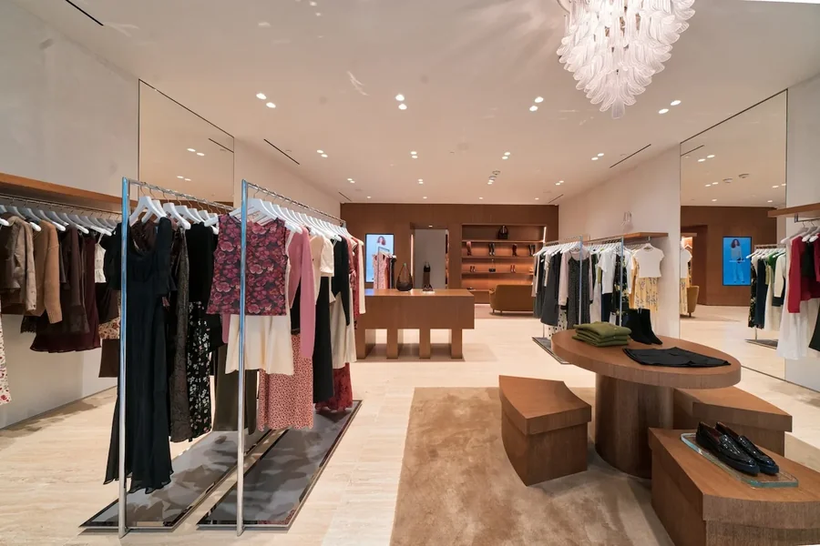
Windows: edit hard, speak clearly
Treat the front window like a landing page. One story per window is enough: a color story, a capsule, or a service such as tailoring, resale, or repair. Make sure the Promise-to-Proof chain is visible in three seconds—a concise headline, one or two looks that match the claim, and a small material or care detail that signals substance. If your audience discovers looks on their phones, make search part of the design language. Amour Vert’s explainer on visual search in fashion retail shows how to connect physical displays with digital discovery without visual clutter.
Operations that keep standards high
Great storefronts stay great because someone owns the basics. Write down who proofs vinyl before it goes up, who wipes finger marks from metal plates, who checks lamp color after replacements, and who retires signage when a message is out of date. Photograph the storefront when it is right and save that image as the “standard.” Use a short materials list for every refresh so you are not hunting month to month. If you run seasonal edits, block the calendar now and keep the changes tight: window theme, header copy, product pulls, and any small plate updates. The goal is to avoid design drift that confuses passersby or trains loyal customers to ignore the window.
Measurement without complexity
You do not need a heavy analytics stack to know whether the storefront is working. Track the ratio of passersby to door opens during staffed hours, note first-visit conversion on days you change windows, and watch repeat-visit percentage tied to loyalty or email signups. Tag weekends with a one-line note—“new capsule window,” “sign relamped,” “hours plate updated”—and look for small lifts. Sustainable choices help here too: when materials age well and type is consistent, improvements tend to show up as steadier conversion rather than one-off spikes.
Two quick use cases
A coastal women’s boutique moved from glossy coated plaques to corrosion-resistant brushed metal for its nameplate and hours panel, matched the finish on interior shelf markers, and relamped the sign with warmer LEDs. The window shifted to a single capsule with a short headline and one fabric detail. Within six weeks, staff reported fewer “what are your hours?” interruptions and a higher share of customers walking straight to the featured rack. The investment was modest, and the finish held up through wind-blown salt without weekly polishing.
A Midwestern multi-brand store standardized typography on the door, glass header, and pickup tag, cut window copy by half, and placed a small care panel next to the handle. They also photographed the finished storefront and used it as a checklist for weekend resets. Footfall stayed flat, but the door-open rate on Saturdays rose a few points, and first-visit conversions on window-change days improved. Nothing about the product mix changed; the storefront simply made the shop easier to read at a glance.
Conclusion: sustainable boutique branding that converts
Sustainable boutique branding is not a set of trends; it is a series of small, consistent choices. Durable finishes like corrosion-resistant brushed metal keep hardware tidy and legible. Clear type and edited windows reduce friction at the curb. Lighting that respects color and energy makes the experience honest and affordable to run. When you anchor the storefront to a steady material palette, carry the same language inside the threshold, and assign simple ownership for upkeep, you make it easier for the right customer to step in—and easier for your team to maintain the standard week after week.