How Page Flows Helps Designers Browse Real UI Screen Types Instead of Static Dribbble Shots
Static design inspiration can help with color, spacing, typography, and layout direction. The problem starts when polished shots become the main reference for product decisions. A signup screen, dashboard, checkout, onboarding step, or settings area is not a poster. It has a job, a sequence, and a user who may want to finish fast.
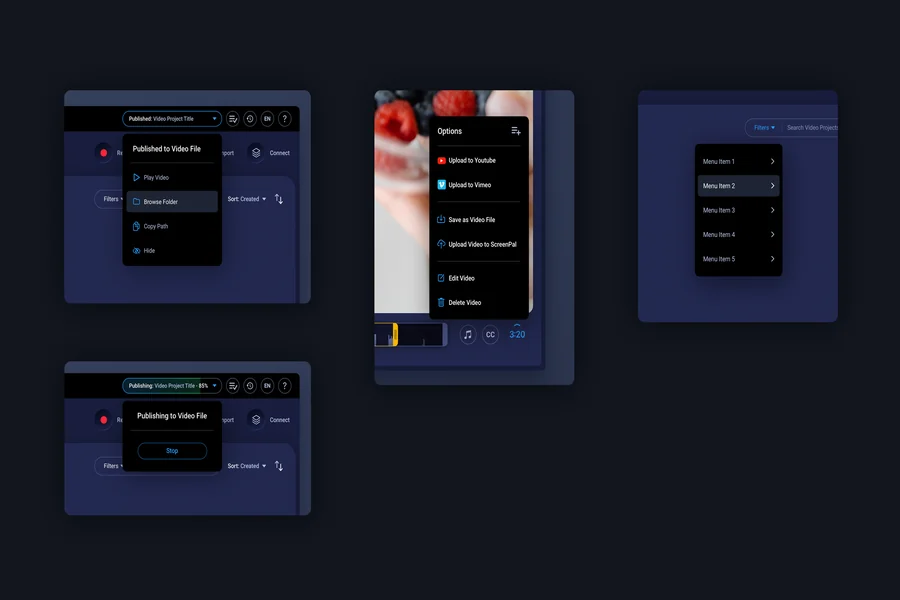
Page Flows gives designers a more practical way to browse screen types from real apps and websites. Its screen directory, available at pageflows.com/all-screens, helps teams study actual dashboards, signups, onboarding screens, checkouts, and settings screens. This matters because a real screen carries constraints that static Dribbble shots often remove.
Static Shots Are Often Too Clean for Product Work
Dribbble is strong at showing taste, craft, and visual exploration. It can help a designer notice a fresh layout or a sharper visual style. Those benefits are real, but they do not show how a working product guides a user from one decision to the next. Error states, loading states, permission prompts, empty dashboards, billing details, and recovery paths are often missing.
That gap matters during SaaS and product design work. A screen can look attractive while still failing to answer the user’s next question. A pricing card may look balanced but hide limits that buyers need before choosing. When teams rely too much on static visuals, they may copy the surface while missing the reason a screen works.
Page Flows Makes Screen Type Research More Concrete
Page Flows is useful because it organizes references around real screen types and product experiences. Teams can study how screens appear inside actual apps and websites, then compare what each screen is trying to solve. A dashboard can be reviewed as a starting point for action, not as a grid of cards. A signup screen can be judged by its timing, fields, copy, and trust cues.
This kind of browsing fits common product questions. How much should a dashboard show when an account is new? Where should checkout explain billing terms? What belongs in settings, and what should stay in the main workflow?
Real Screens Preserve the Pressure Around Each Choice
A real screen shows more than visual style. It shows priorities, tradeoffs, and the amount of explanation a product gives at a specific moment. It also shows what the product hides, delays, or repeats. That is useful for teams reviewing their own flows because many UX issues come from timing rather than layout alone.
| Research Need | Static Dribbble Shot | Page Flows Screen Research |
|---|---|---|
| Visual direction | Strong for style and layout ideas | Useful when visual choices need product context |
| Signup review | May show a clean form without sequence | Shows how real products ask for data and guide action |
| Checkout decisions | May hide billing risk and confirmation details | Helps compare how payment moments explain commitment |
Good Benchmarks Compare Screen Jobs, Not Decoration
A useful screen benchmark begins with the purpose of the screen. Signup should reduce doubt and collect only what the product can justify. Login should help returning users regain access without friction. Dashboard should orient users and point to the next valuable action.
Screen Types Reveal Where Trust Is Won or Lost
Dashboard, checkout, signup, onboarding, and settings screens all handle trust in different ways. A dashboard earns trust by showing progress, value, and a clear next move. A checkout earns trust by making payment terms visible before commitment.
Onboarding earns trust by asking users to do work only when the benefit is clear. Settings earns trust by making control easy to find after signup is complete. The important point is that trust is not held in one page. It moves through the product, and screen type research helps teams see where that movement becomes weaker.
A Better Role for Dribbble and Page Flows
This comparison does not make Dribbble irrelevant. Dribbble can still support visual exploration, brand mood, and early creative direction. It is most useful when the team knows that the reference is not proof of product clarity. A beautiful static shot should start a question, not close a decision.
Page Flows serves a different research need. It helps designers browse real UI screen types with more product context and less guesswork. This is valuable for teams reviewing dashboards, signups, onboarding paths, checkouts, settings, and pricing screens. The stronger use is comparison, question building, and sharper review of a product’s own screens. The less obvious lesson is that inspiration becomes more valuable when it stays close to use. A static shot can make a screen look finished before its behavior has been tested. A real screen example reminds teams that design quality includes timing, recovery, trust, and the next action.